Introduction to churn dynamics
The purpose is to discover a vision of the churn dynamics at the company level with a unique subscription view.
In this area of the software, we propose a series of analytics that will enable users to review the evolution of churn on a monthly basis. We have designed these screens to help users understand the key churn trends.
As such, we have built the tool around two main design principles:
Design principle #1: Churn should be tracked first and foremost at the (Marketing) Product family level
We have opted to measure the churn at the Marketing Product Family level for several reasons:
belonging to a certain marketing product is usually a strong explanation of churn,
marketing products SPEAK to marketing teams, as they relate to real products sold to end users
marketing teams are usually very focused on evolving / steering the marketing product mix along top -own strategic company objectives such as the increase of multiplay penetration, the acceleration of convergence etc.
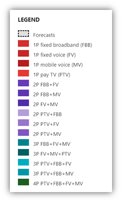
Here, we regroup them by 1P, 2P, 3P and 4P using color codes (see legend below)
Design principle #2: Churn when assessed over relatively long time series should be measured in priority “LTM” (over the Last twelve months) to enable marketing teams to identify the building of trends of churn improvement or worsening. Churn can be very hard to interpret on a month per month basis (volatility, guerrilla marketing; etc). The LTM approach will enable users to isolate the key trends.
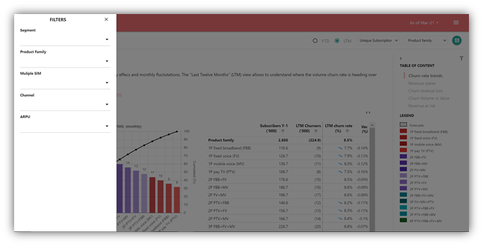
The control panel on the LEFT displays the selected FILTERS: definition a subset of the scope to analyse (multiple selection)
Customer Segment
This should be customized per operator, to reflect the Operator’s taxonomy and macro segmentation
Example of possible taxonomy: Residential, B2B, SoHo, Corporate
This can be important on the B2B front, as it can be subdivided into segments that have different business dynamics (SoHo vs. Large Accounts, etc.)
Marketing Product Family Very useful if for instance users want to see at once:
ALL 2P marketing products
ALL marketing products with some FBB
ALL converging marketing products (with at least one fixed product and one SIM)
ALL 3P and 4P marketing products altogether
Etc.
MultiSIM : Very useful if for instance users want to see at once:
Only the subscriptions which have only 1 mobile SIM
Only the subscriptions which have 2 or more mobile SIMs
Channel of distribution : what is the churn pattern of customers acquired by a certain channel?
ARPU range
The available filters are presented on the left side menu allowing to select the different filter criteria on which apply the churn dynamics metrics calculation. The application of the filter criteria is performed while closing the filters side panel.
The filters above allow users to generate any kind of combinations, such as:
What is the churn of 3P non convergent customers?
What is the churn of non-convergent fixed only households?
What is the churn rate of mobile only customers acquired only through direct channels?
What is the churn of convergent households with 2 or more SIM cards?
What happens to customers paying more than 40€ per month?
Design principle #3 : The churn dynamics can be assessed on a Monthly basis or Annual Basis. Monthly is a sliding LTM view over the last 12 months. Annual is a sliding view of the LTM at each end of fiscal year [1]over the last 3 years. Each propose different forecasting scenario to assess the landing at the end of the fiscal year and beyond.

[1] The definition of the end of fiscal year month is defined into the Tenant configuration
The control panel on the TOP displays :
The view button (Monthly LTM vs. Annual)
The forecasting scenario :
Stationary (default) : Gross Adds, Migration Rate, LTM Churn Rate, ARPU and Churners data (Volume, Revenue) stay at the same values
Same trends : Gross Adds, Migration Rate, LTM Churn Rate, ARPU and Churn ARPU follow the same trends over the 3 last months (moving average)
Optimistic trends : Gross Adds, Migration Rate, LTM Churn Rate, ARPU and Churners data (Volume, Revenue) follow the best trends (66th best percentile) over the last 3 months
Pessimistic trends : Gross Adds, Migration Rate, LTM Churn Rate, ARPU and Churners data (Volume, Revenue) follow the worst trends (66th worst percentile) over the last 3 months
The button to export the view data to Excel (XSLX) with monthly and annual data and forecasts
The refresh button allow users having the churn-dynamics:force-refresh permission to force the recomputation of the business model. Beware it spends around 1-2 minutes.
When you select any Trends tab, the application displays the evolution of the metric over the past periods and the forecasts accordingly with the selection forecast scenario. The Trends tab displays the forecasting error in % measured on the last 12 months.
The top right green button regroups all the data that support all the different subs sections of the churn dynamics analysis. Such data can be read on the screen or uploaded to Excel or another usual format.
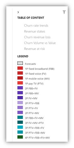
The Navigation panel on the right side displays the different subs sections of the churn dynamics analysis as a table of content. It allows to click on the link to jump to the associated chart.
The Marketing Product Family color legend is displayed along the chart visualisation into the Navigation panel. Whatever the Marketing Product Family criteria, the same product colors applied.
For every churn dynamic metrics below, =chart description and usage comments are displayed along the chart.
At the end of the churn dynamics analysis, there is a button to go forward to the list of Clusters (see below).
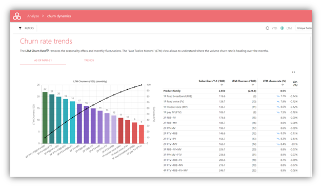
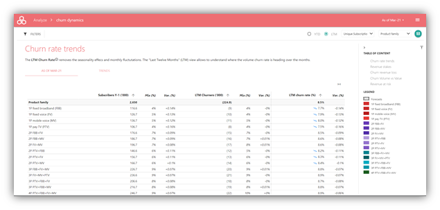
Churn rate trends
The purpose is to represent i) the main stakes of volume churn at the Marketing Product Family level and ii) the corresponding evolution of churn rate; expressed LTM to remove the “noise” of monthly up and down which can be erratic.
Description
This first screen proposes a ranking of all LTM churners at the Marketing Product Family level with a pareto index
How to analyse the chart?
We believe the view per Marketing Product Family to be by far the most relevant level to analyse churn for several reasons:
The churn rate is highly correlated to belonging to a certain Marketing Product Family: fixed voice is in decline everywhere (high churn rate), multiplay and convergence Marketing Product Families are growing (lower churn rates), etc.
The number of services attached to a single subscription has a strong correlation on churn: in other words, 3P Marketing Product Families generally churn less than 1P Marketing Product Families
Marketing Product Families inform on two crucial dimensions for marketing teams and CXO:
o How mulitplay and monoplay Marketing Product Families perform in comparison
o How convergent and non-convergent Marketing Product Families perform in comparison
In addition, the LTM view allows to offset the “noise” from the month over month variations and provides a clear view of the building trends.
This first chart provides a very useful view of the distribution of churners at the Marketing Product Family level. It answers important business questions:
Where are the churners? How are they distributed across Marketing Product Families?
What is the law of concentration of the churners?
What Marketing Product Families should concentrate most of attention of the marketing team (from a volume perspective)?
The table of the right details how the churn is calculated
Numerator and denominator are recalled in absolute numbers
The calculation of the volume churn rate is therefore detailed
An arrow informs on the current churn trend for each cluster
Definitions
LEFT (CHART)
LTM churners = sum of unique customers lost over the last 12 months
RIGHT (TABLE)
Subscribers Y-1 ('000) = unique customers BOP Year [N-1]
LTM Churners ('000) = sum of unique customers lost over the last 12 months
LTM churn rate (%) = [ LTM Churners ('000) / Subscribers Y-1 ('000)]
Var. (%) = variation in LTM churn rate between the current and the previous period (either previous month, or previous rate)
Illustration: LTM churn rate March 2021 = [LTM Churners ('000) as of March 2021 / Unique customers BOP March 2020]
The table can be expended into a richer / more complete table with more columns as seen above.
Definitions
Subscribers Y-1 ('000) = unique customers BOP Year [N-1]
Mix (%) = mix of Subscribers Y-1
Var. (%) = [current minus previous period / previous period]
LTM Churners ('000) = sum of unique customers lost over the last 12 months
Mix (%) = mix of LTM Churners ('000)
Var. (%) = [current minus previous period / previous period]
LTM churn rate (%) = [sum of unique customers lost over the last 12 months / unique customers BOP Year [N-1]
Var. (%) = [current minus previous period / previous period]
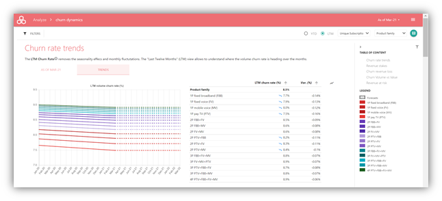
Description
Exploring Churn rate TRENDS, users can get a more detailed view of the evolution of churn rates:
Users can see in one visual the evolution of each Marketing Product Family churn rate
Over the LAST 6 months
And estimated over the NEXT 6 months
Forecast scenario: maintain the current LTM churn rate
This will provide users with a very clear and concise snapshot of the overall churn trend for each marketing product: how did churn evolve in recent history, and where is it heading?
How to analyse the chart?
Tracking LTM churn rates at the Marketing Product Family level is probably the best way to track churn over a long period of time. We can see here in a nutshell for each Marketing Product Family:
Whether the churn trend was stable, improving or deteriorating over the previous months,
Where the churn trend is heading directionally.
This view will help marketing team check the overall efficiency of their actions at a relatively high level, with some strategic insight:
Definitions
LTM churn rate (%) = [sum of unique customers lost over the last 12 months / unique customers BOP Year [N-1]
Var. (%) = [current minus previous period / previous period]
Revenue stakes
The purpose is to display the volume of revenue exposed to churn over the Marketing Product Families and for each Marketing Product Family the main characteristics of churn rate and ARPU.
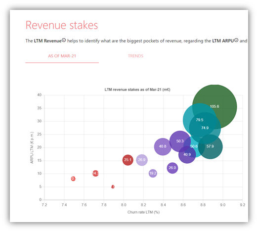
Description
The revenue stakes screen allows users to identify what are the revenue stakes for each Marketing Product Family, in relation to the LTM ARPU and the LTM Churn rate.
This visual reminds users at any time of the respective revenue weight of each Marketing Product Family.
How to analyse the chart?
The purpose of this slides is to contextualize the stakes at the Marketing Product Family level, with 3 crucial pieces of information:
Bubble: how big is the Marketing Product Family in terms of LTM revenue?
X axis: is this a Marketing Product Family with a high or low volume churn rate?
Y axis: is this a high ARPU or low ARPU Marketing Product Family?
This is an efficient visual to remind all the company stakeholders on the “exposure” to churn across the Marketing Product Families.
Illustrative example:
“We have large Marketing Product Families (revenue wise) on 3P and 4P, with reasonable churn rate but high ARPUs”
“We have small Marketing Product Families (revenue wise) on 1P with low ARPUs, but suffering from high churn rates”
Showing ARPUs is a worthwhile reminder, as losing one subscription on a 45€ ARPU destroys as much value as losing three subscriptions on 15€ ARPUs. This helps contextualise.
Definitions
Bubble: LTM revenue month N = cumulated revenue over the last 12 months for month N
X axis: LTM churn rate = [Total churners LTM month N / Subscribers BoP Month N-11]
Y axis: LTM ARPU = [LTM revenue month N / average subscriber base month N]
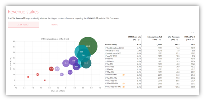
Description
The table next to the bubble chart providers users with de detailed numbers supporting the chart.
Definitions
LTM churn rate = [Total churners LTM month N / Subscribers BoP Month N-11]
Subscriptions AoP (‘000) = [Subscriptions BoP + Subscriptions BoP [N-11]] / 2
LTM revenue month N = cumulated revenue over the last 12 months for month N
LTM ARPU = [LTM revenue month N / Subscriptions AoP month N]
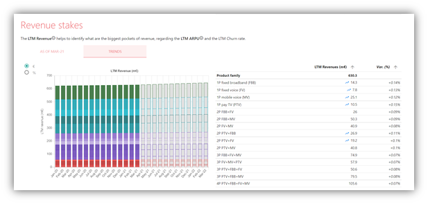
Description
Revenue stakes TRENDS allows users to see the revenue evolution of each Marketing Product Family, over the last 6 months, and an estimate for the next 6 months.
The evolutions can be tracked in absolute value or percentage.
Again, this help contextualize:
What are the growing Marketing Product Families?
What are the declining Marketing Product Families?
How to analyse the chart?
The purpose of this visual is to contextualize the stakes at the Marketing Product Family level.
What Marketing Product Families are on a growing trend? Declining trend?
How is the respective weight of each Marketing Product Family evolving against the total revenue?
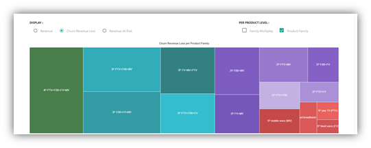
Churn revenue loss
This is exactly the same visuals than previously, but instead of capturing the revenue per Marketing Product Family, we capture here the lost revenue from churn per Marketing Product Family.
Description
The churn revenue loss screen allows users to identify what Marketing Product Families concentrate the largest stakes in terms of lost revenue to churn.
How to analyse the chart?
The purpose of this slides is to contextualize the lost revenue stakes at the Marketing Product Family level, with 3 crucial pieces of information:
Bubble: how big is the Marketing Product Family in terms of revenue lost to churn?
X axis: is this a Marketing Product Family with a high or low volume churn rate?
Y axis: is this a high ARPU or low ARPU Marketing Product Family?
This view is very useful for marketing teams, at is allows i) to prioritize and ii) contextualize at the same time.
The bubble size allows to prioritise = necessity to prioritise on Marketing Product Families responsible for high lost revenue.
X and Y axis help marketing team contextualise: is the churn rate acceptable or abnormal? Is the company suffering from too high a churn rate on certain Marketing Product Families?
Definitions
Churn revenue loss = value of cumulated churners over the last 12 months
LTM Churn ARPU = [ value of cumulated churners over the last 12 months / LTM Churners ('000) ]
LTM churn rate = [Total churners LTM month N / Subscribers BoP Month N-11]
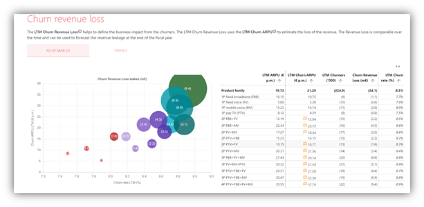
Description
This is a table to support the chart on the left side by bringing more information and easing the reading of the data.
How to analyse the chart?
This is a complement to the chart.
The arrows allow users to deep dive on the biggest Marketing Product Families and review the key metrics.
Definitions
Churn revenue loss = value of cumulated churners over the last 12 months
LTM Churners ('000) = sum of unique customers lost over the last 12 months
LTM Churn ARPU = [ value of cumulated churners over the last 12 months / LTM Churners ('000) ]
LTM churn rate = [Total churners LTM month N / Subscribers BoP Month N-11]
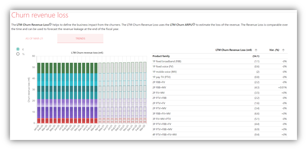
Description
TRENDS allows users to see the lost revenue evolution of each Marketing Product Family, over the last 6 months, and an estimate for the next 6 months.
The evolutions can be tracked in absolute value or percentage.
How to analyse the chart?
The purpose of this visual is to contextualize the lost revenue at the Marketing Product Family level.
What Marketing Product Families are a growing concern in terms of lost revenue?
What Marketing Product Families are diminishing in terms of lost revenue.
Churn Volume vs Value
Description
The comparison between the churn in Volume (LTM Churners) and in Value (LTM Revenue Loss) informs whether the destroys more or less value.
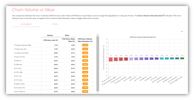
How to analyse the chart?
A deviation is > 0 means LTM Churn rate > LTM Churn Value Rate
The company is losing customers with relatively less value that the rest of the Marketing Product Family
POSITIVE SIGN of churn control = value strategy e.g. keep customers with the most value
A deviation is < 0 means LTM Churn rate < LTM Churn Value Rate
The company is losing customers with relatively more value that the rest of the Marketing Product Family
NEGATIVE SIGN of churn control
Definitions
LTM churn rate = [Total churners LTM month N / Subscribers BoP Month N-11]
LTM Churn Value Rate = [Churn revenue loss / Revenue LTM [Y-1]]
LTM Churn Volume-Value Deviation (%) = [ [LTM churn rate (volume) - LTM Churn Value Rate] / LTM churn rate (volume) ]
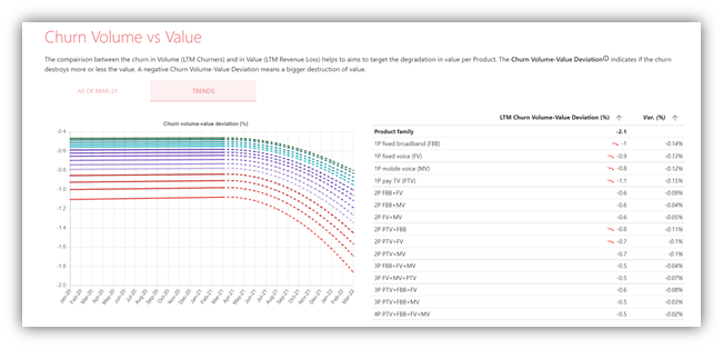
Description
Display over a relatively long time series whether the volume value ratio is stable or evolving.
How to analyse the chart?
Good patterns
A ratio stable above zero
A ratio moving from negative to positive territory
A ratio increasing above zero
Negative patterns
A ratio stable below zero
A ratio moving from positive to negative territory
A ratio declining below zero
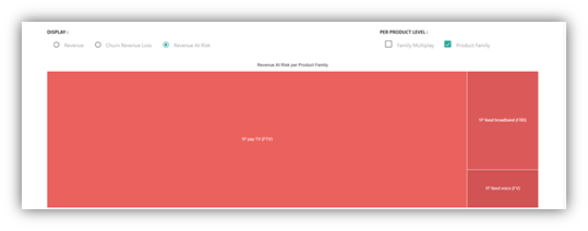
Revenue at risk
Display the distribution of revenue at risk over each Marketing Product Family.
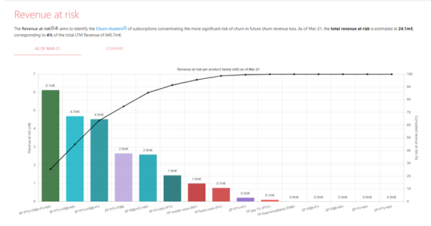
Description
We display here the revenue at risk for each Marketing Product Family.
Revenue at risk are a NEW notion at this stage of the software i.e. we introduce here this notion for the first time. Revenue at risk are a sub product of our clustering tool. One cluster is attached ONLY to one Marketing Product Family. For each cluster the tool calculates the revenue at risk for a certain time horizon.
On this visual, the software regroups ALL the clusters per Marketing Product Family.
We can therefore assess how much revenue at risk is attached to each Marketing Product Family.
How to analyse the chart?
This visual serves as a bridge between
all of the previous analytics which were essentially description of the churn trends affecting the Marketing Product Family and,
the notion of revenue at risk generated by the clustering tool.
This visual allow users to
Identity the Marketing Product Families that concentrate the most risk
Get a sense of the pareto / distribution of revenue at risk across all Marketing Product Families
This is therefore a very useful tool to prioritize the attention of marketing teams on the Marketing Product Family which “embed” the most revenue at risk.
Definitions
Revenue at risk = Estimating the revenue from at-risk subscriptions scoped by the churn clusters with a precision over 78% and with risk horizons of 3 months or less.
View of revenue
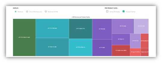
View of churn revenue loss
View of revenue at risk = related churn clusters
Description
The COMPARE section allows to visually compare 3 tree maps with different notions, across all Marketing Product Families:
A view of the revenue stakes
A view of the revenue loss from churn
A view of the revenue at risk (as generated by the clustering engine)
How to analyse the chart?
The chart will allow users to intuitively compare the different areas.
What Marketing Product Families are “overweighted” in terms of revenue at risk
What Marketing Product Families are “underweighted” in terms of revenue at risk