Explore the cluster details
The main purpose of the cluster details is to help you to understand the root causes of churn within the context of the cluster and to initiate a dedicated marketing or care action plan for the cluster's subscriptions at risk. (See What is Cluster for more details about the key concept of cluster in Lifetime Analytics)
The UI is organized into 3 panels:
Left panel - Cluster information : Revenue and volume at risk, cluster definition, monthly past churners, overlapping with others clusters, similar clusters existing in previous snapshots
Right panel - Action plan setup : picking some marketing or care actions from the Action Library (see Action Library) and/or the recommendation performed by the application , writing some comments about the clusters
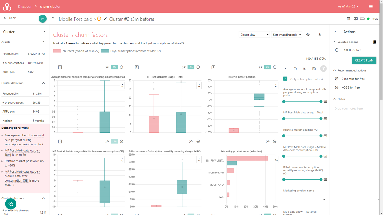
Central panel - Churn factor comparison and cluster's subscriptions at risk dashboard : analyse deeply the behavior of churners in comparison with loyal subscription before the churn events (Horizon defines the number of months of comparison before the churn events)
Cluster information panel
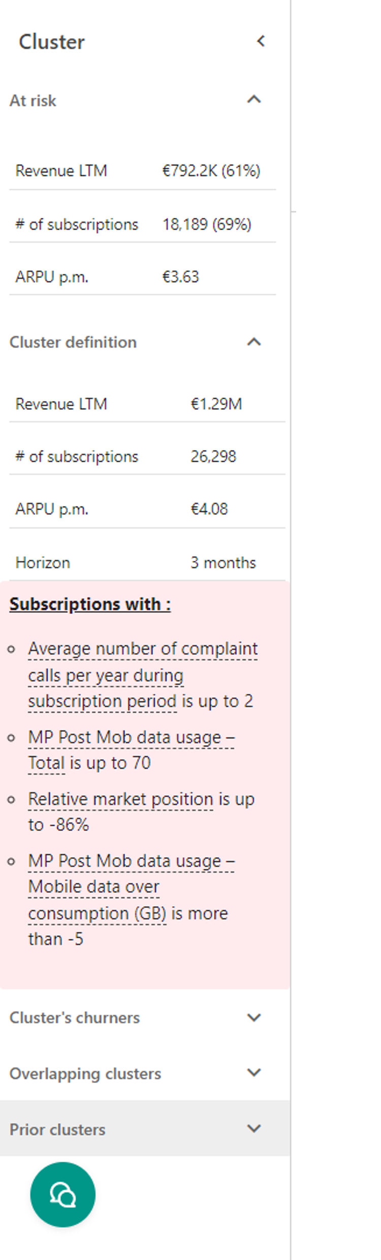
The panel displays displays the cluster information with different sections :
At risk
Revenue at Risk : sum of 12 months of revenue MRC of the cluster's active subscriptions, free of commitment or having at least one missed payment L3M
Volume at Risk : Number of the cluster's active subscriptions, free of commitment or having at least one missed payment L3M
ARPU at Risk : Revenue at risk / Volume at risk / 12
Cluster definition
Revenue LTM : sum of 12 months of revenue MRC of the cluster's active subscriptions
Volume : Number of the cluster's active subscriptions
Cluster definition displayed as a list of terms : passing over displays the definition of the data (see Data Reference), clicking onto the term display the Churn factor evolution UI (see Factor explorer article)
Cluster churners
Number of monthly churners LTM : total number of monthly churners matching the cluster definition over LTM.
LTM Churn rate (cluster) : total number of monthly churners matching the cluster definition over LTM divided by the total number of active subscriptions matching the cluster definition during the LTM period existing at the beginning of the LTM period (usually 12 months before)
Churn Revenue Loss LTM : sum of the billed revenue LTM of the LTM churners, to describe the past business weight of the cluster.
Median tenure : median tenure in months of the LTM churners
Billed ARPU : Revenue LTM of the LTM churners / LTM churners / 12
Operator cancellation ratio : percentage of subscription cancellation issued by the operator
Mix per competitor of the portability : data provided by the CRM (see Data Reference)
Mix per churn reason given by the subscriber : data provided by the CRM (see Data Reference)
Overlapping clusters
List of clusters overlapping the same active subscriptions. The ratio gives a percentage about how much the active subscriptions are the same between the current cluster and the listed clusters. Pressing the arrow button navigates to the listed cluster details.
Prior clusters
List per snapshot date, the similarly existing clusters. Pressing the arrow button navigates to the listed cluster details.
Each section can be collapsed or expanded to ease the display while pressing the chevron buttons.
Churn factors comparison Central panel
The panel allows to compare per churn factor / data the behaviors for churners (red) and the still active subscriptions / loyals (green) - n months (horizon) before the churn event. The main concept is that monthly churners are analysed as cohort before they churn to understand how they become churners.
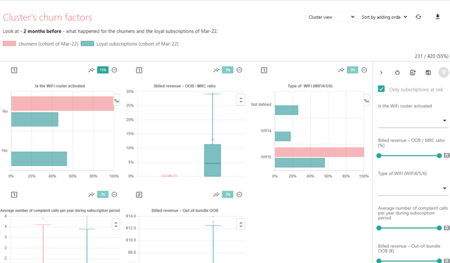
Churn factor comparison charts
Each chart displays the distribution of the values for the related data, depending the data type :
Bar chart is displayed for types : text, zip code, year, gender
Box plot is displayed for types : number, currency
The chart displayed as rank 1 (squared number) is a direct churn factor of the cluster definition. It contributes actively to the definition of the churn cluster. The chart displayed as rank 2 is a co-correlation of a rank 1 churn factor, having an absolute Pearson correlation coefficient greater than 0.8 between both data.
The "insights" button opens the churn factor evolution explorer for the related data associated to the chart.
The "importance" is an index of how the data is contributing to the detection of churn in the product family. It is a direct measure of the importance of the factor as a churn factor. The value is based upon SHAP values.
The "remove" button removes the chart from the dashboard.
Bar chart
In absolute view (default mode or press # button) , the bar chart displays the mix of each value within churner and loyal populations.
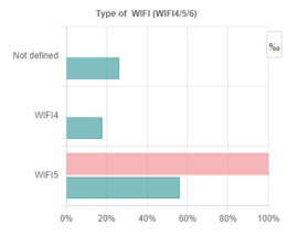
In relative view (press the 0/00 button), the bar chart displays the percentage (in 1/1000) of the value for the churners over the loyals.
Box plot chart
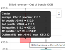
The box plot displays into a single whisker shape (box plot) : min without outliers, first quartile, median, mean, third quartile and max without outliers. It allows to compare the whole distribution of the values for churners and loyals, without loosing insights due to the mean aggregation.
The outliers are defined as any value below (min outliers) 1st quartile - 1.5 * IQR or above (max outliers) as 3rd quartile + 1.5 * IQR. IQR is the interquartile range interval as 3rd quartile - 1st quartile.
While pressing the double chevron button, it displays the box plot chart with or without the outliers.
Adding and filtering factor comparison charts
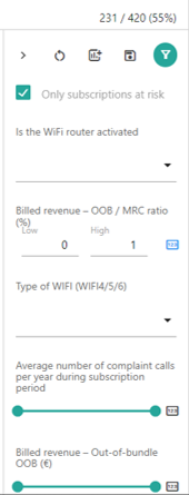
The right filter panel proposes a list of filters based on the churn factors / data. While refining the range (eg. revenue OOB) or selecting (eg. marketing product name) and pressing to the "filter" button, it applies the selected criteria to all the churn factor charts.
Checking the "Subscriptions at risk only" applies or not the filter equivalent to the free of commitment or at least one missed payment L3M.
Pressing on the "123" switch the filter input as a range slider or as a numerical interval input. The effect is equivalent.
Pressing the "reset" button removes all the added factor charts from the dashboard.
The "save" allows to save the added filters and the selected ranges of values. Please press "save" when you are comfortable with the selected filters and ranges.
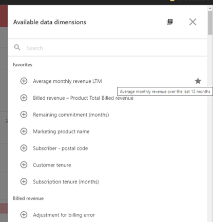
While pressing the "add" button opens a data selector panel, it lists by category name all the available data (see Data Reference as defined as dimension) from the Product Family.
While clicking onto the "circled plus" button, it adds the selected data as a factor chart into the dashboard.
The search box allows you filter the list of data by name, category or definition.
The "star" button allows you to define or remove the data as favorites, appearing always on the top of the list.
The "library" button navigates to the Data Reference UI (see Data Reference).
Press the "close" button to exit the data selector panel.
Changing the display of churn factor charts

Selecting the cluster view, displays only the churners matching the cluster definition. Selecting the Product Family view, displays with all the churners of the product family, for comparison.
Sorting differently the factor comparison charts, by :
adding order : following the picking order of the charts
importance : descending order of importance of churn factor
name : sorting by name
The refresh button allows to refresh the cluster metrics, filters, selection and notes as edited by the last user having saved.
The export button exports to an Excel file, the list of cluster cohort subscriptions including the selected data
Draft Action Plan - Right Panel
The purpose the panel is to draft some marketing or care action about the subscriptions at risk of the cluster. The details of the action plan can achieved later (see Define Action Plan).
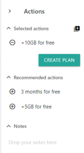
The list of selected action contains the action you have selected from :
You add from the recommended actions (automatically recommended by the application)
You pick an action from the action library while pressing "library plus" button. The button opens a action selector panel.
Once you have set your actions, you just need to click on Create plan and navigates to your action plan to define it for the cluster. If the cluster has already an existing action plan, the button is renamed "Open Plan". However, if you want to create an addition plan, you can press the "plus" button (right side of the Create Plan button).
While you are deep diving into the cluster, you can drop your notes or review the notes from another team mate.